Michał Janicki — City of Highland Park
Utilizing design to benefit city residents, visitors and businesses.
Brand Strategy / Creative Direction / Design / Environmental Graphics
Brand Strategy / Creative Direction / Design / Environmental Graphics
Project Summary
Role
Lead Designer
Lead Designer
Agency
Samata
Samata
Deliverables
Brand Launch Strategy
Brand Guidelines
Publication Templates
Signage and Wayfinding
Brand Launch Strategy
Brand Guidelines
Publication Templates
Signage and Wayfinding
About the effort
The City of Highland Park, a close suburb of Chicago, approached us to help launch their new brand. Our studio was tasked with implementing the launch by working with various business and resident stakeholders, as well as production partners. Over the course of several months we became familiar with what goes into running a city, and what success looks like to residents, business owners, and city officials.
The City of Highland Park, a close suburb of Chicago, approached us to help launch their new brand. Our studio was tasked with implementing the launch by working with various business and resident stakeholders, as well as production partners. Over the course of several months we became familiar with what goes into running a city, and what success looks like to residents, business owners, and city officials.
The Solution
Templates and systems
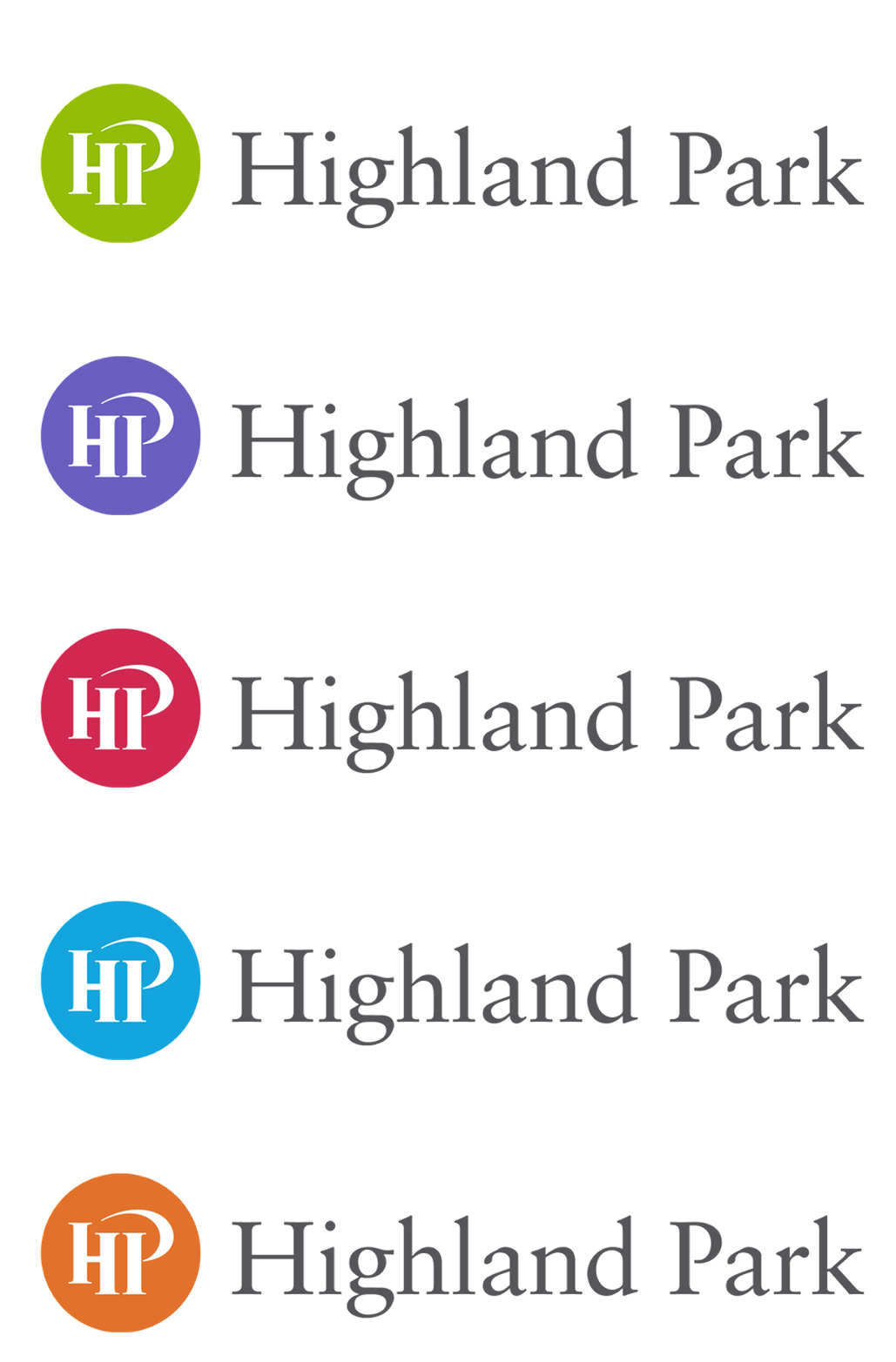
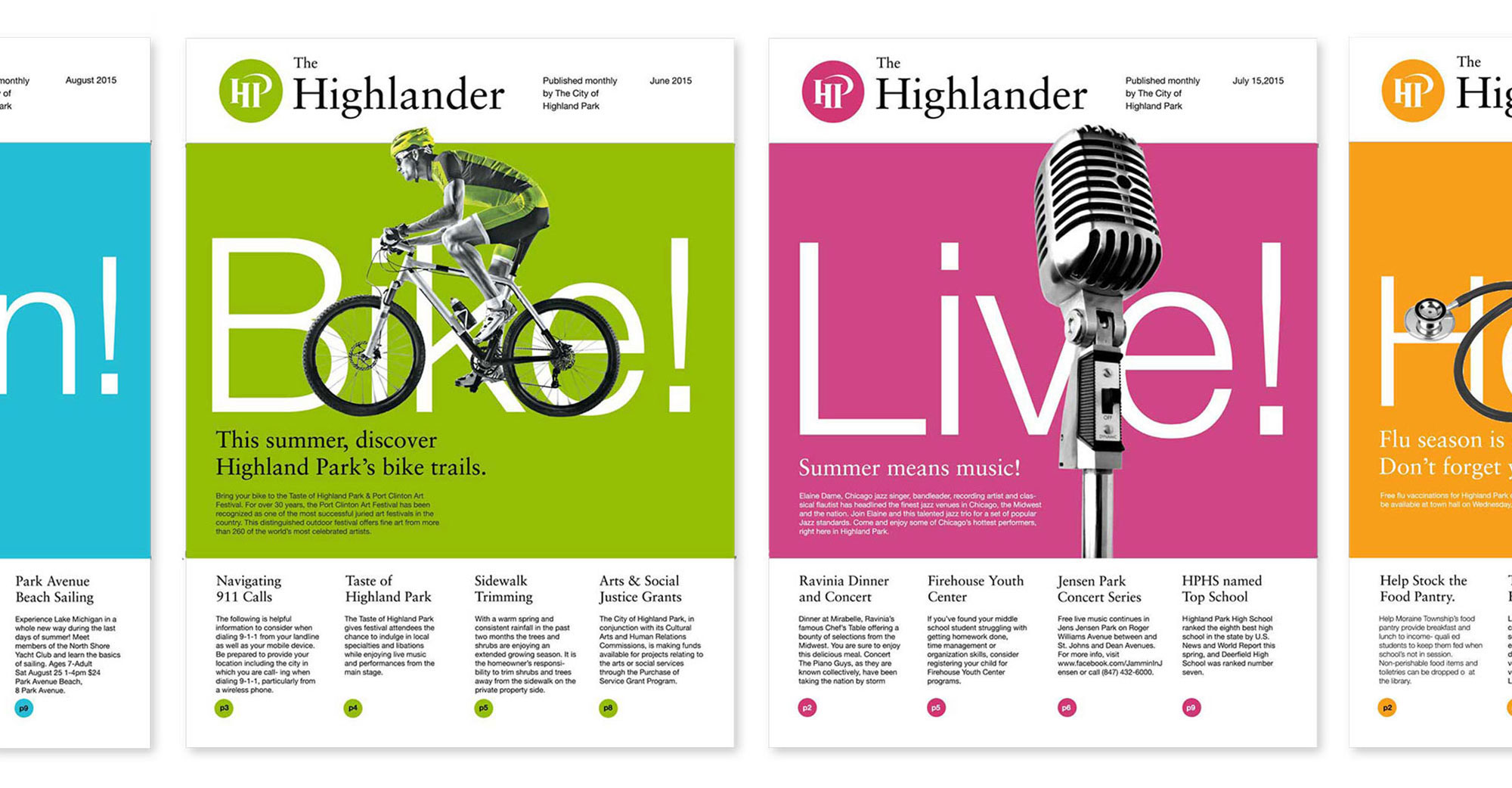
The existing branding symbol, a green circle with stylized type, was created by another agency and approved by the city government. We created a flexible design system with several colors and logo lock ups for various applications. Our first project was to work on a publication mailed to residents each month. We were able to showcase the use of color, inexpensive stock photography, and more casual language to create an open conversation with the residents. By working closely with city publication designers during the release of the re-designed issue, we were able to address their questions on layout, production, and image-sourcing.
The existing branding symbol, a green circle with stylized type, was created by another agency and approved by the city government. We created a flexible design system with several colors and logo lock ups for various applications. Our first project was to work on a publication mailed to residents each month. We were able to showcase the use of color, inexpensive stock photography, and more casual language to create an open conversation with the residents. By working closely with city publication designers during the release of the re-designed issue, we were able to address their questions on layout, production, and image-sourcing.
Finding the way with way finding
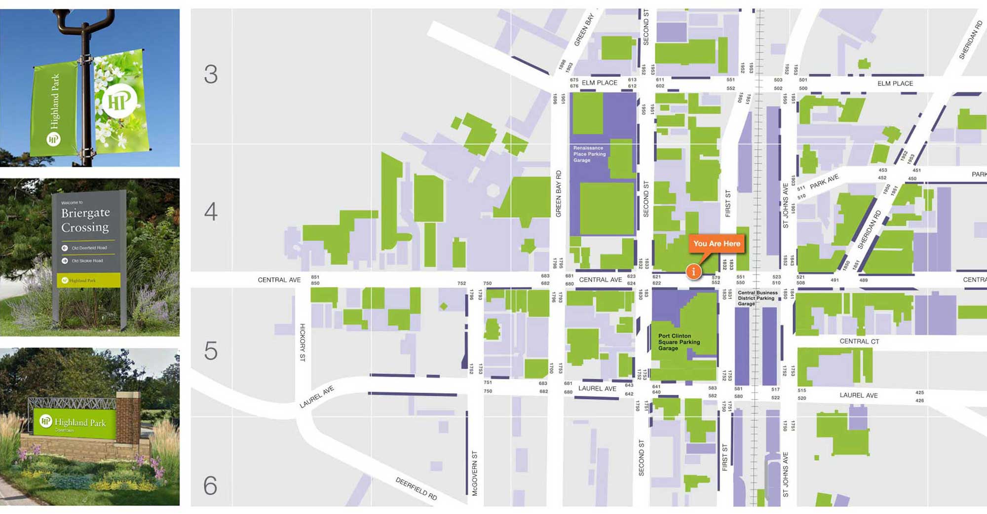
Next, we created guidelines for implementing signage, paying extra attention to legibility and contrast. We re-drew the city maps and utilized a grid approach to showing city streets, parking structures, attractions and shopping centers.
Next, we created guidelines for implementing signage, paying extra attention to legibility and contrast. We re-drew the city maps and utilized a grid approach to showing city streets, parking structures, attractions and shopping centers.
Signage systems
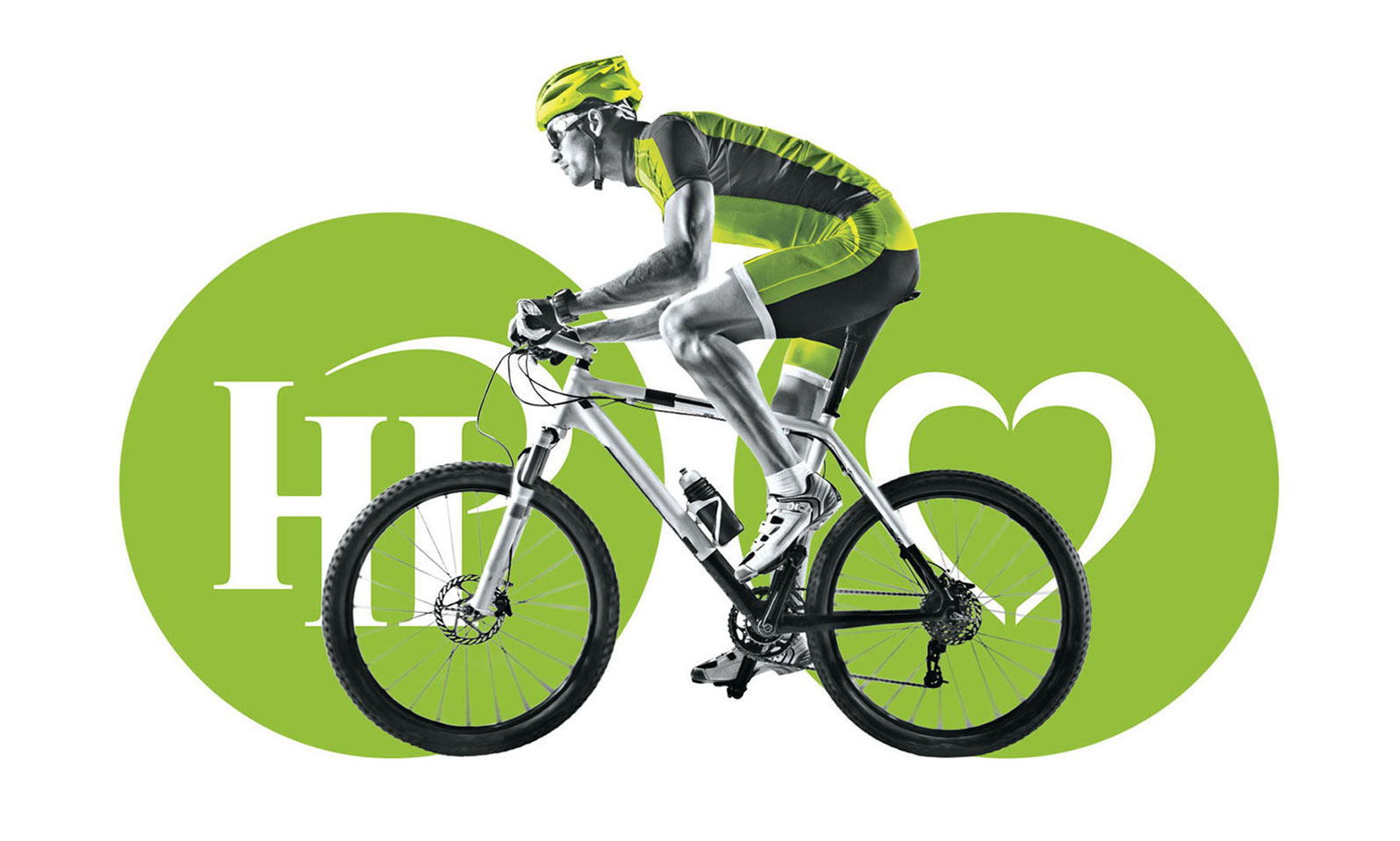
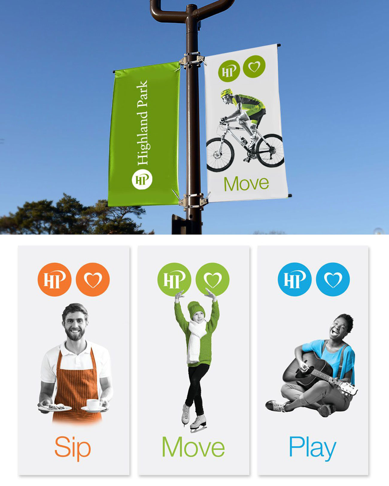
My favorite part of the project was creating the hanging signage across the city. We expanded the green HP circle by adding a stylized heart to highlight all that the city has to offer. We solicited ideas for simple verbs from the community, sourced imagery, and created scannable messages of celebration.
My favorite part of the project was creating the hanging signage across the city. We expanded the green HP circle by adding a stylized heart to highlight all that the city has to offer. We solicited ideas for simple verbs from the community, sourced imagery, and created scannable messages of celebration.
Moving the system across applications
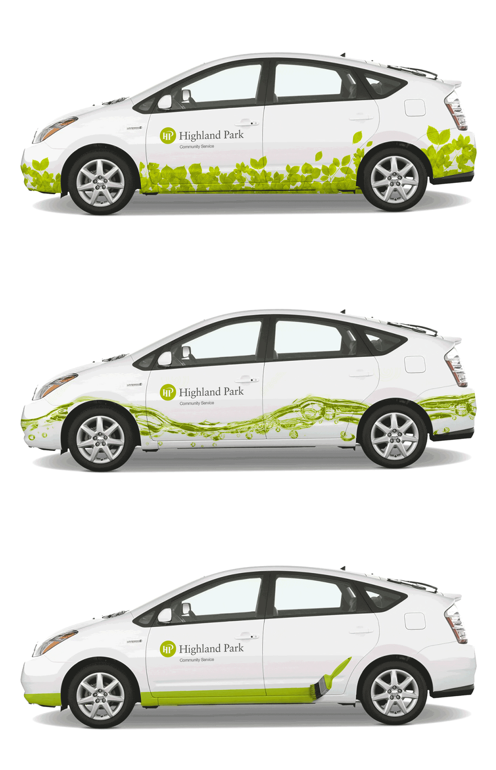
In addition to signage, stationary, publications and way finding, we had many other applications of the brand, where we implemented a simple, minimal feel to stand out from the surrounding cities. The Community Service vehicles utilized playful wraps to provide delight to residents, and foster pride in the city.
In addition to signage, stationary, publications and way finding, we had many other applications of the brand, where we implemented a simple, minimal feel to stand out from the surrounding cities. The Community Service vehicles utilized playful wraps to provide delight to residents, and foster pride in the city.
Conclusions
Impact
Wins
The biggest wins came from seeing the brand system used by city officials, and receiving positive feedback from the community. By having an open and collaborative relationship, we were able to address the design challenges in a realistic way that was possible to implement with the available resources and budgets. Keeping the design minimal and modern was a great win in terms of educating officials on the value of directness and simplicity in all forms of communication.
Learnings
Working with production partners, such as printers and signage specialists, we learned a lot about the process. We also quickly realized that the design work we were providing had to live outside of our own laptops and be usable by a variety of individuals. Creating accessible files in InDesign, Illustrator, and Photoshop made us realize just how important a clean file set up is for success.
5.5%
Business and employment growth over one year
Business and employment growth over one year
+80
New signs and maps
New signs and maps
+52
Bimonthly newsletters sent
Bimonthly newsletters sent
Wins
The biggest wins came from seeing the brand system used by city officials, and receiving positive feedback from the community. By having an open and collaborative relationship, we were able to address the design challenges in a realistic way that was possible to implement with the available resources and budgets. Keeping the design minimal and modern was a great win in terms of educating officials on the value of directness and simplicity in all forms of communication.
Learnings
Working with production partners, such as printers and signage specialists, we learned a lot about the process. We also quickly realized that the design work we were providing had to live outside of our own laptops and be usable by a variety of individuals. Creating accessible files in InDesign, Illustrator, and Photoshop made us realize just how important a clean file set up is for success.
More work
IDEO
Human-Centered Design
Studiobema Art Collective
UI + UX & Visual Design
Mack Trucks
UI + UX & Augmented Reality